> ## Content Index
> Fetch the complete content index at: https://reactpractice.dev/llms.txt
> Use this file to discover other available public pages before exploring further.
# How to display a grid of images
- URL: https://reactpractice.dev/articles/how-to-display-a-grid-of-images/
- Published: 2025-02-05T15:26:07.000Z
- Updated: 2026-06-01T01:58:40.000Z
- Author: Corina Udrescu
- Tags: Articles, #corina-2, #Import 2026-06-09 12:07
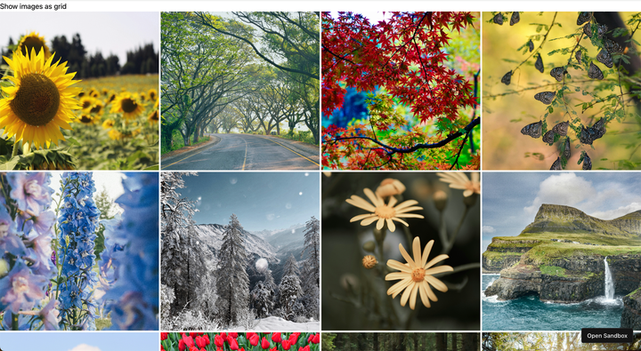
Say you want to display 12 images in a grid view. How would you do it without skewing the images and making sure they each fit their square?
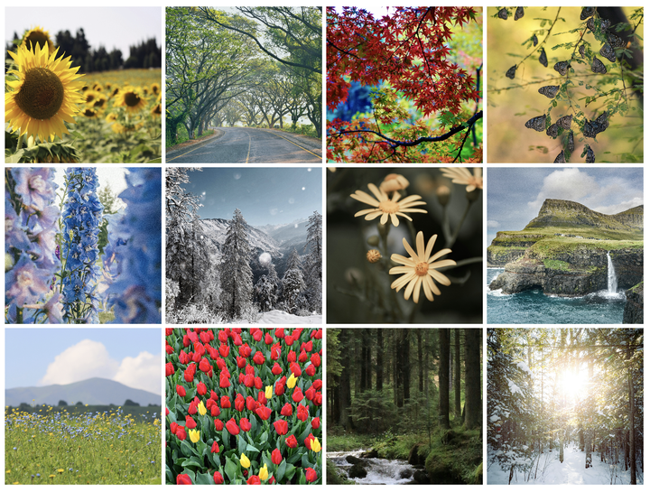
The easiest way is using CSS Grid.
Let's go over it below, first as plain CSS and then using Tailwind.
Here is the HTML markup we will be using:
```
```
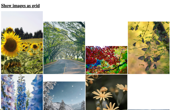
Before we apply any styling, this is how the images look like:
## Using plain CSS
### Use display grid to show 4 columns
To display the image gallery as a grid, we can use the `display:grid` property and show 4 equal width columns:
```
.image-gallery {
display: grid;
grid-template-columns: repeat(4, 1fr);
}
```
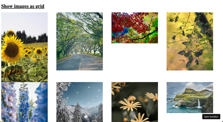
### Show images as full width to fill the page
We can use set the width and height of the images to 100%, so the gallery looks more like a grid:
```
.image-gallery img {
width: 100%;
height: 100%;
}
```
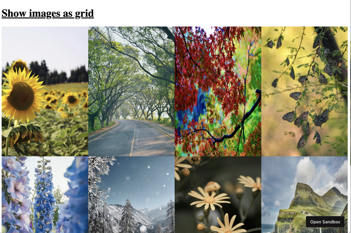
### Fix skewing using object-fit
The CSS `object-fit` property allows us to specify how the image should fill the available space - by default this is `stretch`, which is why the images were skewed above. We can set it to `cover` to fix this:
```
.image-gallery img {
...
object-fit: cover;
}
```
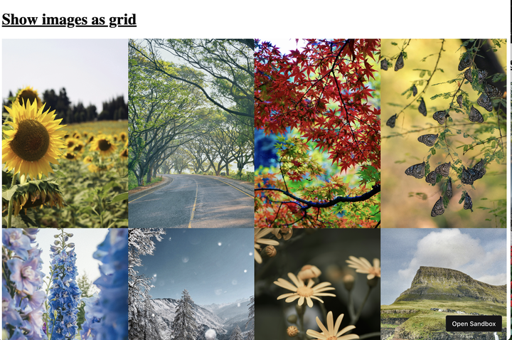
### Add grid gap for spacing between images
It would be nice to have some spacing between the images - CSS grid has a built in property for thus - `gap`:
```
.image-gallery {
...
gap: 5px;
}
```
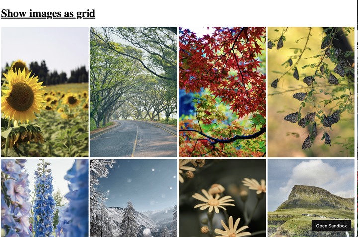
### Show as squares using aspect ratio
Our gallery is almost done! But it would be nice to have the images shown as squares, instead of portrait as now. We can achieve that using the `aspect-ratio` property:
```
.image-gallery img {
...
aspect-ratio: 1;
}
```
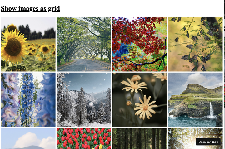
### Keep images together even on wide screens
If you are viewing this on a wide screen, you'll probably notice the images are spaced out on the x axis. To fix this, we can add a `width` of `fit-content` to the image gallery, so it does not expand to fit the whole screen:
```
.image-gallery {
width: fit-content;
}
```
### Done!
And that's it! Here is the full CSS:
```
.image-gallery {
display: grid;
grid-template-columns: repeat(4, 1fr);
gap: 5px;
width: fit-content;
}
.image-gallery img {
width: 100%;
height: 100%;
object-fit: cover;
aspect-ratio: 1;
}
```
## Using Tailwind CSS
How would you implement this with Tailwind?
```
...
```
## Practice this yourself!
Did you enjoy this walkthrough? Put your understanding to the test by building a memory game! The images will be displayed using exactly this technique.
[Build a memory gameBuild a memory game in React. You start with 6 images that you will display as 12 cards. By default, they are “flipped” - you only get a placeholder instead of the image. As the user clicks a “card”, flip it around, revealing the image. When the user clicks thereactpractice.devCorina Udrescu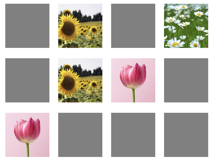](https://reactpractice.dev/exercise/build-a-memory-game/)