Build an Accordion component
An Accordion component displays content as a list of headings that the user can click to collapse/expand the related content.
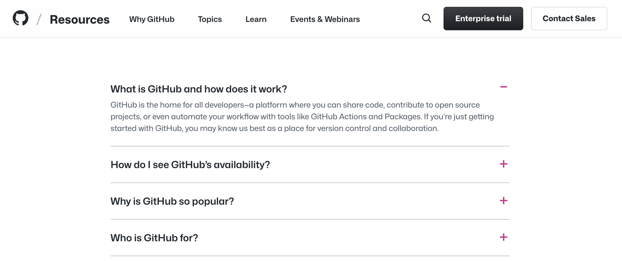
One common use case for Accordions is the Frequently Asked Questions section - here's an example from Github's FAQ.
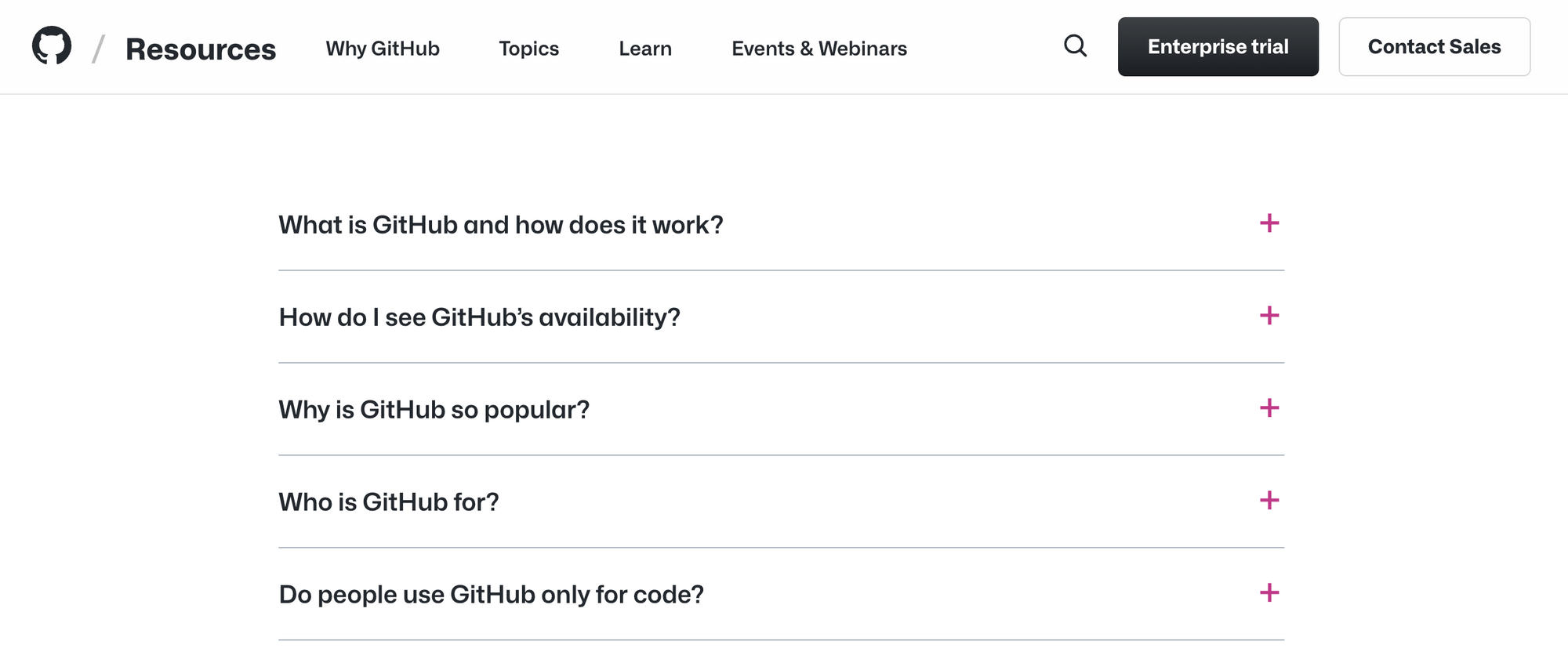
Clicking on an item expands it, revealing the content. Clicking again closes it.
Build an Accordion component that receives a list of items with title and content and displays them as an Accordion.
<Accordion
    items={[
       { title: "Title 1", content: "Content 1" },
       { title: "Title 2", content: "Content 2" },
    ]}
  />
Each heading can be opened and closed individually. Users can open multiple headings at the same time.
You can use this sample data for testing:
[
          {
            title: "What is Github and how does it work?",
            content:
              "GitHub is the home for all developers—a platform where you can share code, contribute to open source projects, or even automate your workflow with tools like GitHub Actions and Packages. If you’re just getting started with GitHub, you may know us best as a place for version control and collaboration.",
          },
          {
            title: "How do I see GitHub's availability?",
            content: "Check our real-time status report",
          },
          {
            title: "Why is GitHub so popular?",
            content:
              "GitHub is built by developers for developers, and we’re proud to be home to the world’s largest open source community. With 50 million developers and millions more open source projects, GitHub has become the go-to place to collaborate and build software together.",
          },
]
Bonus question: How would you implement the component if you could only have one heading expanded at a time?
💡 Ready to check your work?
Become a member and get access to the official solution and the comments section for feedback and discussion.
Also, for a limited time, you will also get a code review when you share a link to your completed challenge in the comments section!

Member discussion