> ## Content Index
> Fetch the complete content index at: https://reactpractice.dev/llms.txt
> Use this file to discover other available public pages before exploring further.
# Tutorial: Build a restaurant reservation widget
- URL: https://reactpractice.dev/solution/tutorial-build-a-restaurant-reservation-widget/
- Published: 2024-12-05T13:04:24.000Z
- Updated: 2026-06-01T01:59:10.000Z
- Author: Corina Udrescu
- Tags: Solutions, #corina-2, #Import 2026-06-09 12:07
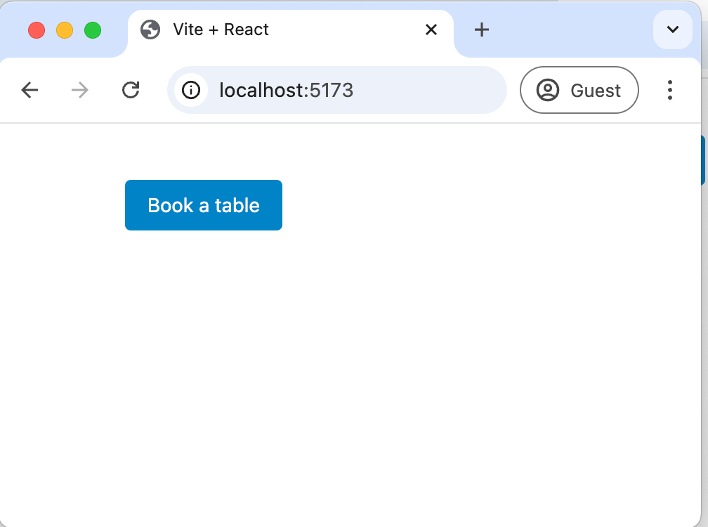
Let's start building the reservation widget by just adding a button that opens a dialog.
For the UI we will use [Headless UI](https://headlessui.com/?ref=reactpractice.dev), so let's install that first:
```
npm install @headlessui/react@latest
```
We can create all our components under `src/components`.
First, we'll make a placeholder for the reservation widget:
```
import ReservationWidget from "./components/ReservationWidget/ReservationWidget";
function App() {
return (
);
}
export default App;
```
### Adding the "Book a table" button
Next, we can add the "Book a table" button. Using the one provided by Headless UI with the styles from [their docs](https://headlessui.com/react/button?ref=reactpractice.dev):
```
import { Button } from "@headlessui/react";
const ReservationWidget = () => {
return (
<>
);
};
export default ReservationWidget;
```
You'll notice in the example above, the css styles are just inlined with the button - this is fine for now, but as we add more buttons to the app, we don't want to keep copy-pasting the styles.
So let's create a new `Button` component, specific to our application, that will just wrap the one from Headless UI:
```
import { Button as HeadlessButton } from "@headlessui/react";
const Button = (props) => {
return (
);
};
export default Button;
```
I created the button under a `ui` folder inside the components folder, to make it clear these are "ui" display components.
### Adding the dialog
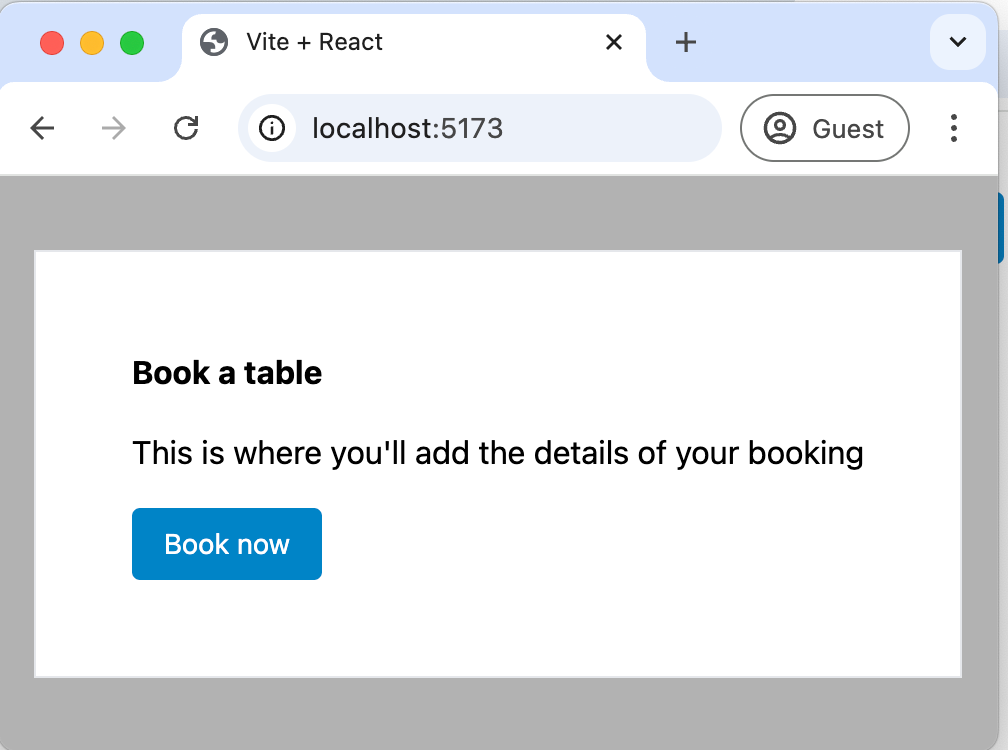
We can use the [Dialog](https://headlessui.com/react/dialog?ref=reactpractice.dev) component from Headless UI using their sample styles.
For showing the backdrop, I used `DialogBackdrop`, as described in the docs.
```
import Button from "../ui/Button";
import {
Dialog,
DialogPanel,
DialogTitle,
DialogBackdrop,
} from "@headlessui/react";
import { useState } from "react";
const ReservationWidget = () => {
const [isOpen, setIsOpen] = useState(false);
return (
<>
);
};
export default ReservationWidget;
```
And that's it - we now have a dialog that shows up when the button is clicked:
### Add form field to choose the number of persons
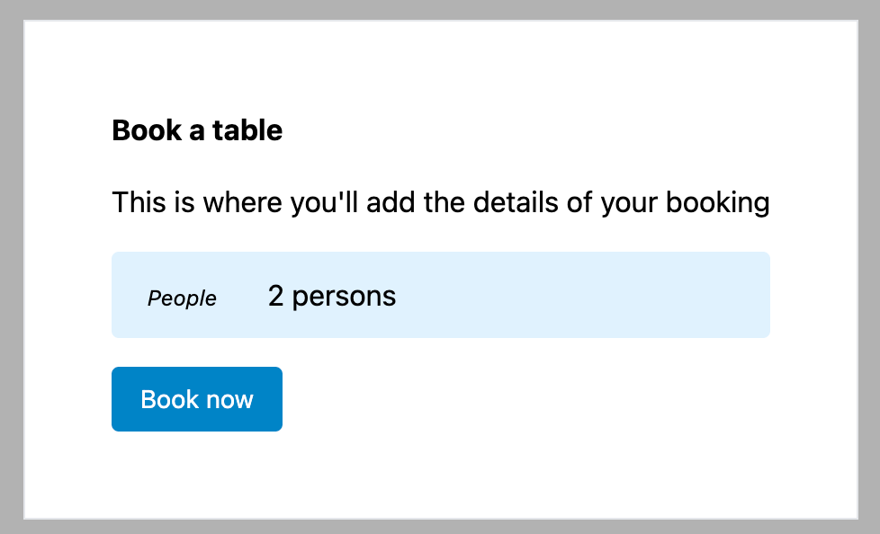
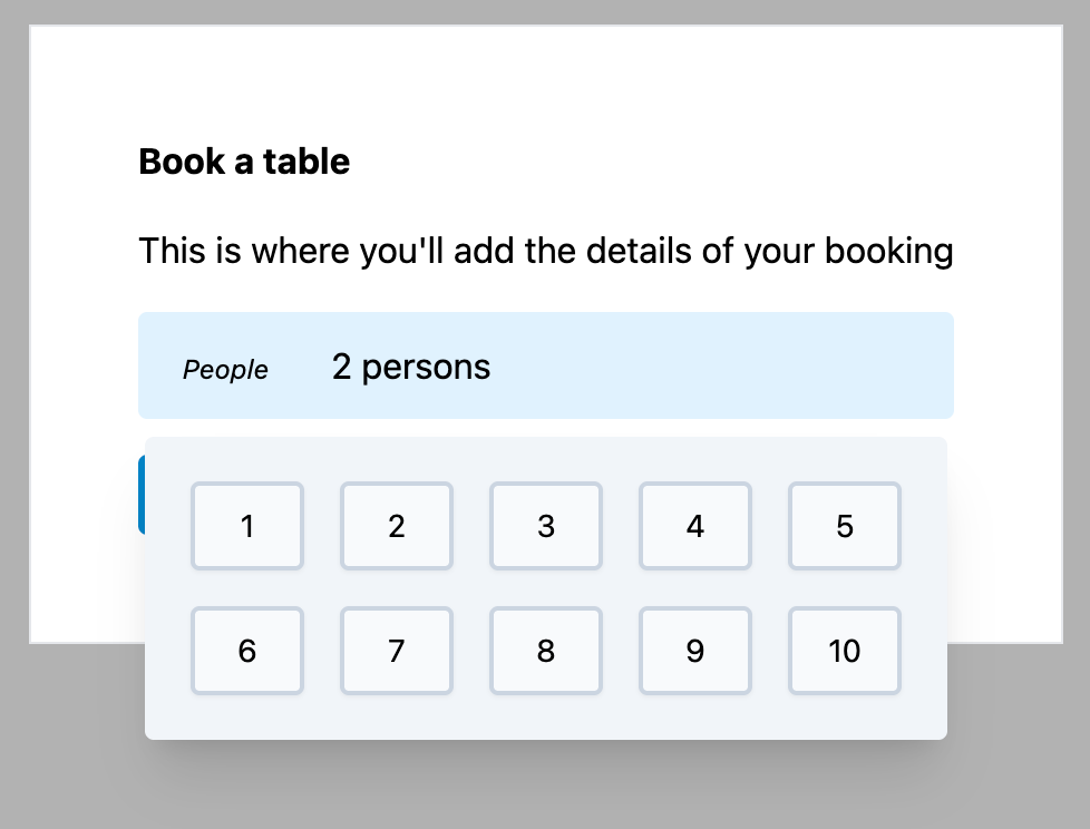
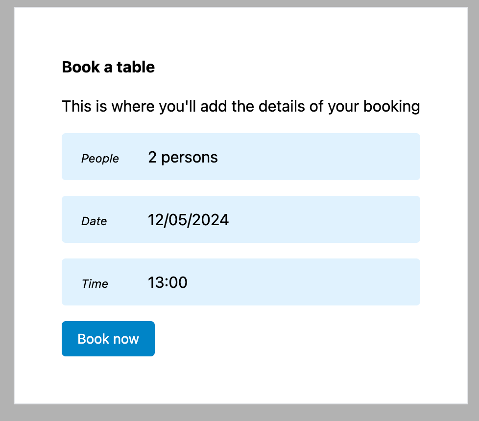
In the wireframe, the user can choose the number of persons by clicking a dropdown that shows a button for each number,1 up to 10 (you can't book for more than 10 persons).
We can use a [Popover](https://headlessui.com/react/popover?ref=reactpractice.dev) from Headless UI to show the floating persons selection.
To keep the logic encapsulated, we'll create a dedicated component just for the persons dropdown. It can act as a controlled component, that has a `value` and emits an `onChange` event.
We can use it as:
```
```
The full component code is below (`src/components/PersonDropdown`):
```
import { Popover, PopoverButton, PopoverPanel } from "@headlessui/react";
import { Button } from "@headlessui/react";
const PersonDropdown = ({ count, setCount }) => {
return (
People{count} persons
{({ close }) => (
{[...Array(10).keys()].map((countOption) => (
))}
)}
);
};
export default PersonDropdown;
```
- we use the shorthand `[...Array(10).keys()]` to get an array containing all numbers from 0 to 9, so we can display the dropdown options
- we style the numbers inside the popover using CSS Grid ([https://tailwindcss.com/docs/grid-template-columns](https://tailwindcss.com/docs/grid-template-columns?ref=reactpractice.dev))
### Adding the date picker
For the date picker, we can use the [React DatePicker](https://reactdatepicker.com/?ref=reactpractice.dev) library, which seems to be the go to for showing date pickers in React.
We want the calendar to appear when the user clicks a button (instead of an input, as is the default). Looking over the docs, it seems like [this is supported](https://reactdatepicker.com/?ref=reactpractice.dev#example-custom-input) using the `customInput` prop:
This is how we will use the calendar in the main component:
```
const [startDate, setStartDate] = useState(new Date());
...
```
And here is the component code:
```
import { useState, forwardRef } from "react";
import DatePicker from "react-datepicker";
import "react-datepicker/dist/react-datepicker.css";
const DateDropdown = ({ date, setDate }) => {
const CustomDatePickerButton = forwardRef(
function renderCustomDatePickerButton({ value, onClick }, ref) {
return (
);
}
);
return (
setDate(date)}
customInput={}
wrapperClassName="w-full"
/>
);
};
export default DateDropdown;
```
React DatePicker wraps our original container with its own wrappers, so we had to pass `wrapperClassName="w-full"` to keep the form field 100% width.
*! Note: There is currently a bug in this solution that the calendar "jumps" a bit when the picker is opened. I'm still investigating a fix for this.*
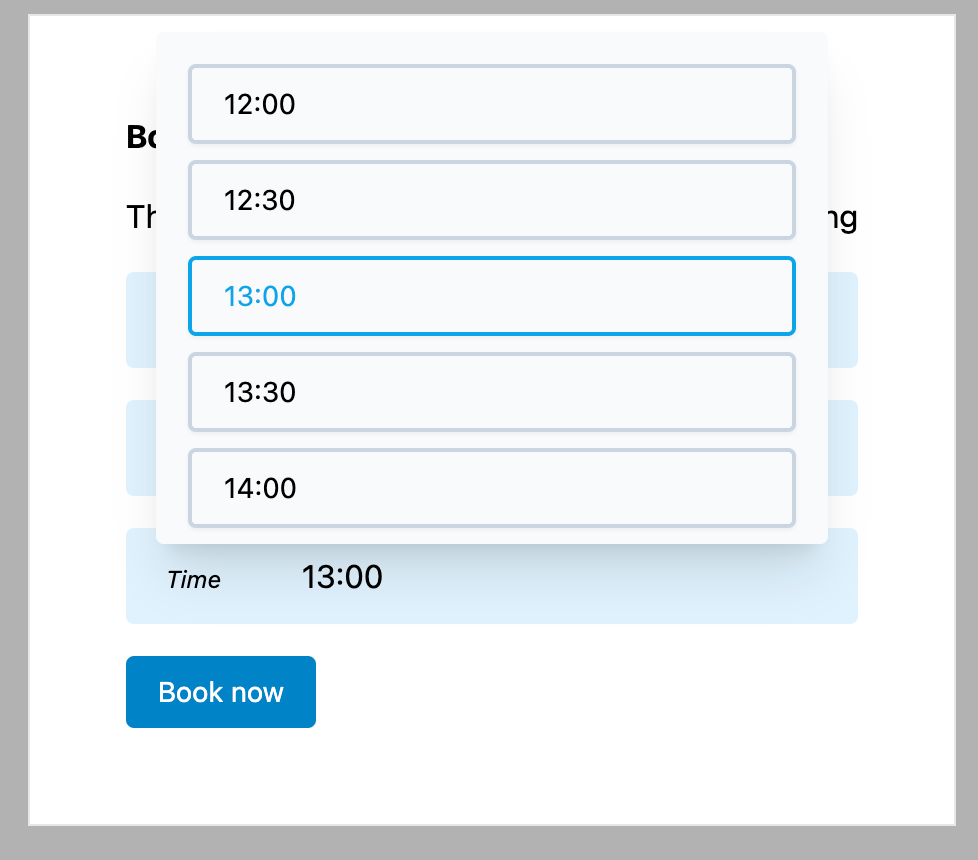
### Adding the time picker
The time picker is pretty much a select where each option is a time slot.
The closest component from Headless UI to what we need is the [ListBox](https://headlessui.com/react/listbox?ref=reactpractice.dev), so let's use that.
To keep things simple, let's create a custom component for this as well, that we can use as follows:
```
const [time, setTime] = useState(new Date());
...
```
To [format the date as time](https://reactpractice.dev/articles/how-to-format-a-date-as-minutes-in-javascript/), we can use `Intl.DateTimeFormat`.
Let's add a helper function:
```
const formatTime = (date) => {
return Intl.DateTimeFormat("en-US", {
hour: "numeric",
hour12: false, // show as 24 hours
minute: "numeric",
}).format(date);
};
```
We want the default time to be 13:00.
Users can book a table between 12:00 and 21:00.
Time slots are open every 30 minutes.
To generate the timeslots for the dropdown, we can create a helper function:
```
const getTimeSlots = () => {
// Time slots start at 12:00
const timeSlotStart = new Date(0, 0, 0, 12, 0, 0);
// Time slots end at 21:00
const endTimeSlot = new Date(0, 0, 0, 21, 0, 0);
let timeSlots = [];
let timeSlot = new Date(timeSlotStart.getTime());
while (timeSlot.getTime() <= endTimeSlot.getTime()) {
timeSlots.push(timeSlot);
timeSlot = new Date(timeSlot.getTime() + 30 * 60 * 1000); // plus 30 minutes
}
return timeSlots;
};
```
The completed component is below:
```
import {
Listbox,
ListboxButton,
ListboxOption,
ListboxOptions,
} from "@headlessui/react";
const formatTime = (date) => {
return Intl.DateTimeFormat("en-US", {
hour: "numeric",
hour12: false, // show as 24 hours
minute: "numeric",
}).format(date);
};
const getTimeSlots = () => {
// Time slots start at 12:00
const timeSlotStart = new Date(0, 0, 0, 12, 0, 0);
// Time slots end at 21:00
const endTimeSlot = new Date(0, 0, 0, 21, 0, 0);
let timeSlots = [];
let timeSlot = new Date(timeSlotStart.getTime());
while (timeSlot.getTime() <= endTimeSlot.getTime()) {
timeSlots.push(timeSlot);
timeSlot = new Date(timeSlot.getTime() + 30 * 60 * 1000); // plus 30 minutes
}
return timeSlots;
};
const TimeDropdown = ({ time, setTime }) => {
const timeSlots = getTimeSlots();
return (
setTime(new Date(t))}>
Time{formatTime(time)}
{timeSlots.map((t) => (
{formatTime(t)}
))}
);
};
export default TimeDropdown;
```
### Going to the next step
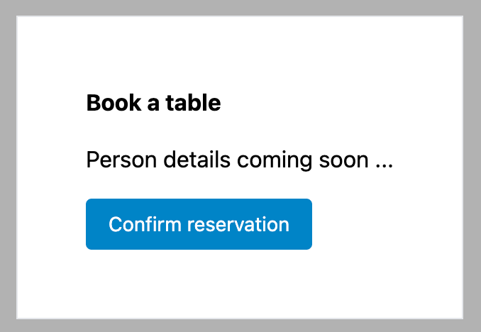
Once the user has entered the details of the booking, he needs to fill in his name and phone number and then he can confirm the reservation.
For this, we'll need to switch to a different "screen" inside the dialog.
The simplest way to achieve this is define a "step" state variable, where we track at step the user is in our workflow.
For our use case, we have just two steps - let's call them `reservation-details` and `contact-details`.
In the main component, we now have the form elements grouped based on the current step:
```
import Button from "../ui/Button";
import {
Dialog,
DialogPanel,
DialogTitle,
DialogBackdrop,
} from "@headlessui/react";
import { useState } from "react";
import PersonDropdown from "./PersonDropdown";
import DateDropdown from "./DateDropdown";
import TimeDropdown from "./TimeDropdown";
const ReservationWidget = () => {
const [isOpen, setIsOpen] = useState(false);
const [personCount, setPersonCount] = useState(2);
const [startDate, setStartDate] = useState(new Date());
const [time, setTime] = useState(new Date(0, 0, 0, 12, 0, 0));
const [step, setStep] = useState("reservation-details");
return (
<>
);
};
export default ReservationWidget;
```
### Entering the name and phone number
Last but not least, let's add two inputs for the name and phone:
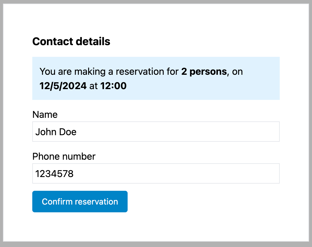
We can use Headless UI [Fieldset](https://headlessui.com/react/fieldset?ref=reactpractice.dev) elements.
Here is the final ReservationWidget component, with everything in place:
```
import Button from "../ui/Button";
import { Field, Fieldset, Input, Label, Legend } from "@headlessui/react";
import {
Dialog,
DialogPanel,
DialogTitle,
DialogBackdrop,
} from "@headlessui/react";
import { useState } from "react";
import PersonDropdown from "./PersonDropdown";
import DateDropdown from "./DateDropdown";
import TimeDropdown from "./TimeDropdown";
import { formatTime, formatDate } from "../../utils/date-helpers";
const ReservationWidget = () => {
const [isOpen, setIsOpen] = useState(false);
const [personCount, setPersonCount] = useState(2);
const [startDate, setStartDate] = useState(new Date());
const [time, setTime] = useState(new Date(0, 0, 0, 12, 0, 0));
const [step, setStep] = useState("reservation-details");
const [name, setName] = useState(2);
const [phone, setPhone] = useState(2);
const logReservationDetails = () => {
console.log("Reservation successful!", {
personCount,
time,
startDate,
name,
phone,
});
};
return (
<>
);
};
export default ReservationWidget;
```
How did you solve this challenge? Share your thoughts in the comments below!